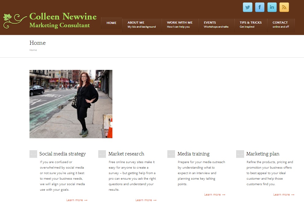
It’s not ready for prime time — but we’re all friends here, so this is a sneak peek at my new consulting website:

As I’ve worked with my website guru to develop this new way to present my consulting services, here are a few thoughts about the process:
- Most of the consulting work I’ve gotten so far has been from friends and referrals from friends. I don’t expect some stranger to Google “marketing consultant New York,” land on my site and call to hire me. That means I’m working on my new website with the intent of it acting as a portfolio. I want to help people who know me learn more about what I do and give them something to share with their colleagues and friends if they want to recommend me.
- Writing the site text with that audience in mind helped guide me to taking a personal tone. There’s no royal “we” on my site. My name is in the header, this is a website about hiring me, so I talk about what I do. I, me. Not we or us. As I’ve talked with solopreneur friends, I’ve come to see being solo as an advantage. Some clients will appreciate I’m the one they talk to about the proposal, the work, meeting logistics, the whole deal. This site aims to find them, not people who want to hire a huge, fancy consulting firm.
- When I had newvinegrowing.com built, I hired a programmer to do it from scratch. He asked for thoughts on sites I liked and didn’t like, for a written description of what I wanted and a sketch of what I thought it should look like. This time, I’m working with a different consultant who recommended the fastest, cheapest way to get it done would be to use a WordPress template. Since I just picked a new template for this blog and I saw the vast expanse of good-looking choices available, that made total sense. So we picked FreshBiz.
- The template offers some spiffy looking features, like an embedded testimonial slideshow, but it’s a template. That means I’m working with someone else’s structure. In the footer, there are four columns. Not three, not five. So I had to think about the content I wanted in my footer, then experiment shuffling it around until it made sense in four buckets. My customization has come together really quickly because we’re working with a defined structure we don’t have to debate or discuss, but it does sometimes mean backing into their form.
When we go live, Marketing Monday will move to colleennewvine.com. I’ve always intended this series for my professional website, doing it here on my blog as a temporary measure, but it took me longer to get my site moving than I hoped. So in 2014, we’ll refocus our conversation here on living life intentionally, without all this marketing talk. Of course if you enjoy this series, I’d love it if you’d join me at colleennewvine.com.
Colleen Newvine Tebeau is a reporter and editor who then earned her MBA at University of Michigan with emphases in marketing and corporate strategy. She is a marketing consultant who helps small and midsized organizations with strategy and tactics, including social media and communications.
Related articles
- Marketing Monday: I need a new website, too (newvinegrowing.wordpress.com)
- Marketing Monday: Beta testing a quick-hit marketing review service offers helpful lessons (newvinegrowing.wordpress.com)

